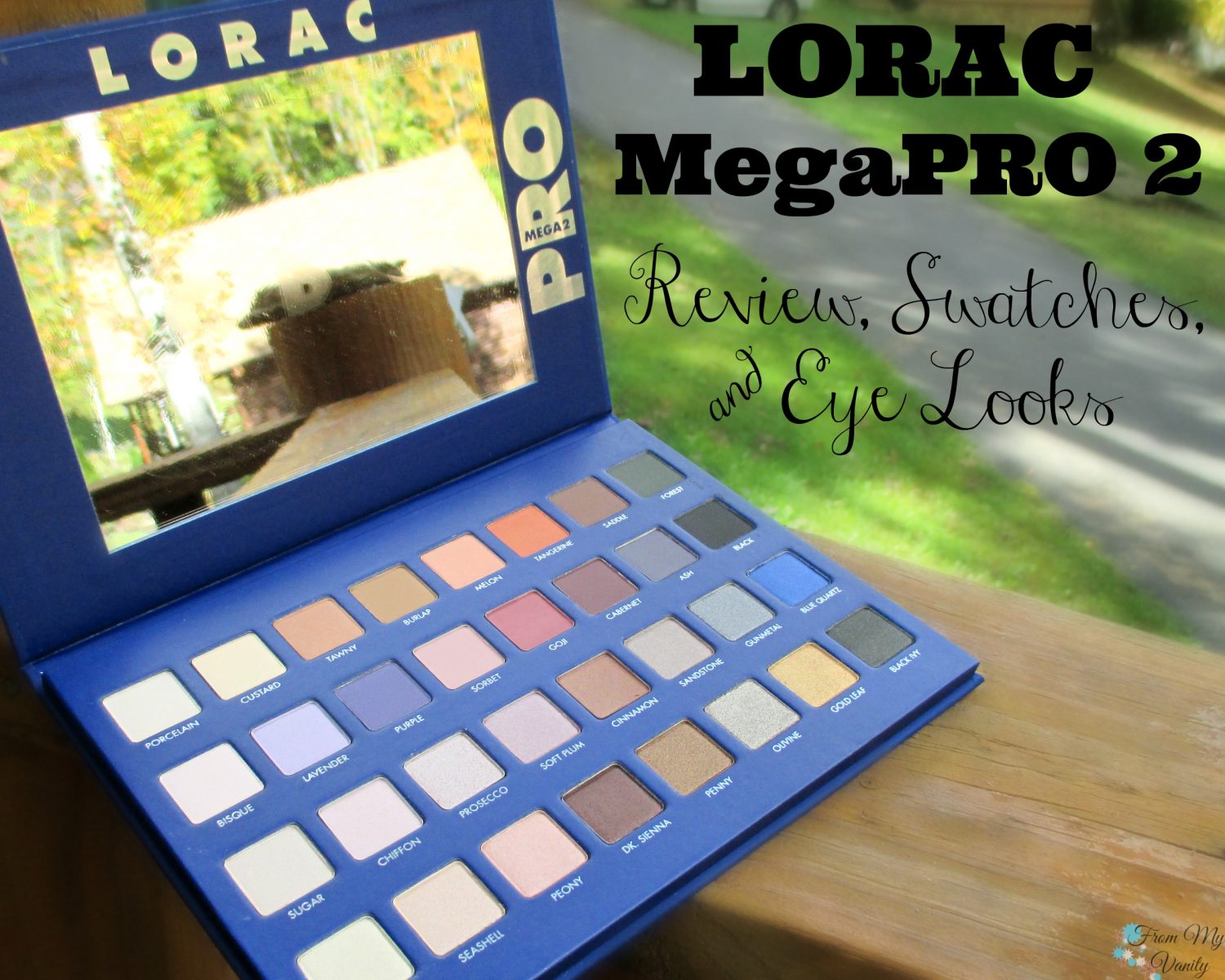
 I know — it’s about time, right? The LORAC Mega PRO 2 palette has been out for a while now, but if you’re still on the fence about if you need this palette or not…I hope my review today will help you decide! And, best part of all, it’s still available on the Ulta website — much better than last year, when it sold out so quickly from every retailer that had it! But, anyways, we’ve got a lot to talk about today so grab a cup of coffee and let’s jump right in!
UPDATE 11/16/16: LORAC has brought this palette BACK! It’s currently available on HSN for $59. Make sure you google coupon codes before making a purchase. First time customers can get as much as $30 off this price!
About the LORAC Mega PRO 2 Palette (Limited Edition!)
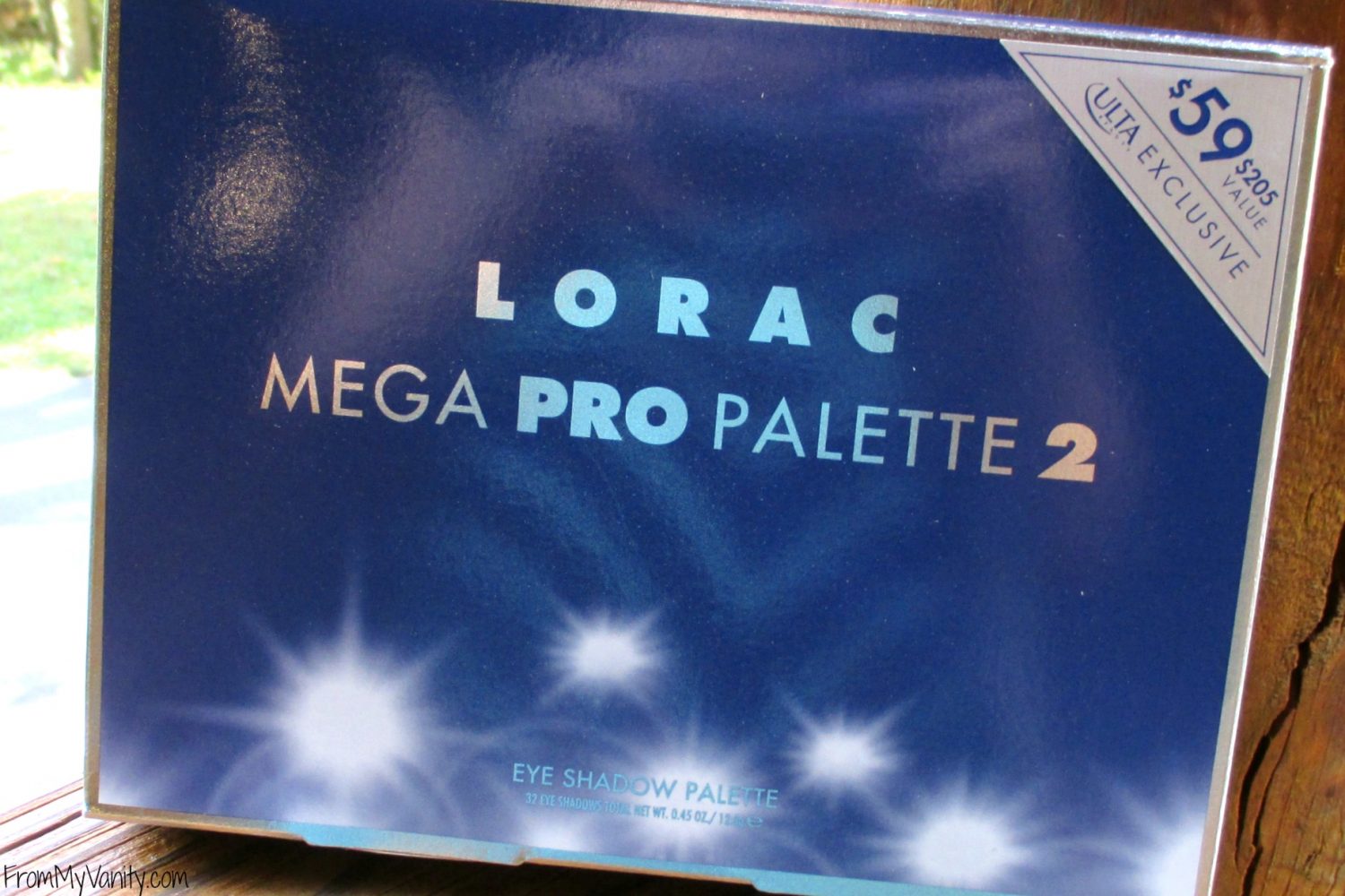
Retail: $59
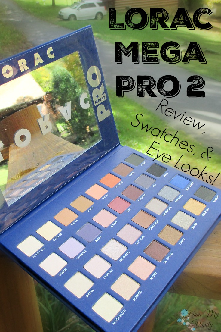
GO PRO with the LORAC Mega PRO Palette 2! Created by celebrity makeup artist Carol Shaw, this limited edition PRO artistry palette is the sequel to their original, best-selling Mega PRO Palette. Double the size of the original PRO Palette, the Mega PRO Palette 2 is loaded with 16 shimmer and 16 matte eye shadows to add to your collection of PRO shadows. Lorac’s velvety-smooth shadows are infused with soothing botanicals and are ultra-pigmented to perform wet or dry so you can shade, shadow, line and define your eyes, just like a PRO!
A $205 value!
My Review of LORAC Mega PRO 2 Palette
As you guys know, I’ve been looking forward to the release of this palette all year — I was able to get their original Mega PRO palette last year and have loved using it. I never shared a review on here (because it wasn’t available anywhere), but I’ve mentioned it often on my social media and in monthly favorites, so you know I love it. 🙂 When I first saw this palette on social media, I was kind of disappointed — the palette didn’t look that interesting or unique, but being a die-hard LORAC PRO palette fan, I was determined to buy it the day it was released.
 And I am so glad I did! To kind of give away my overall thoughts on this palette….let me just tell you that I LOVE this palette more than the original Mega palette! (Surprised? So was I! But keep reading to find out why!) Before we dive into all the reasons why I love this palette so much, let’s take a look at the different shadows you get with this palette and the quality of each.
Each swatch was gone over twice to get the pigmentation you see. No primer was used. 🙂
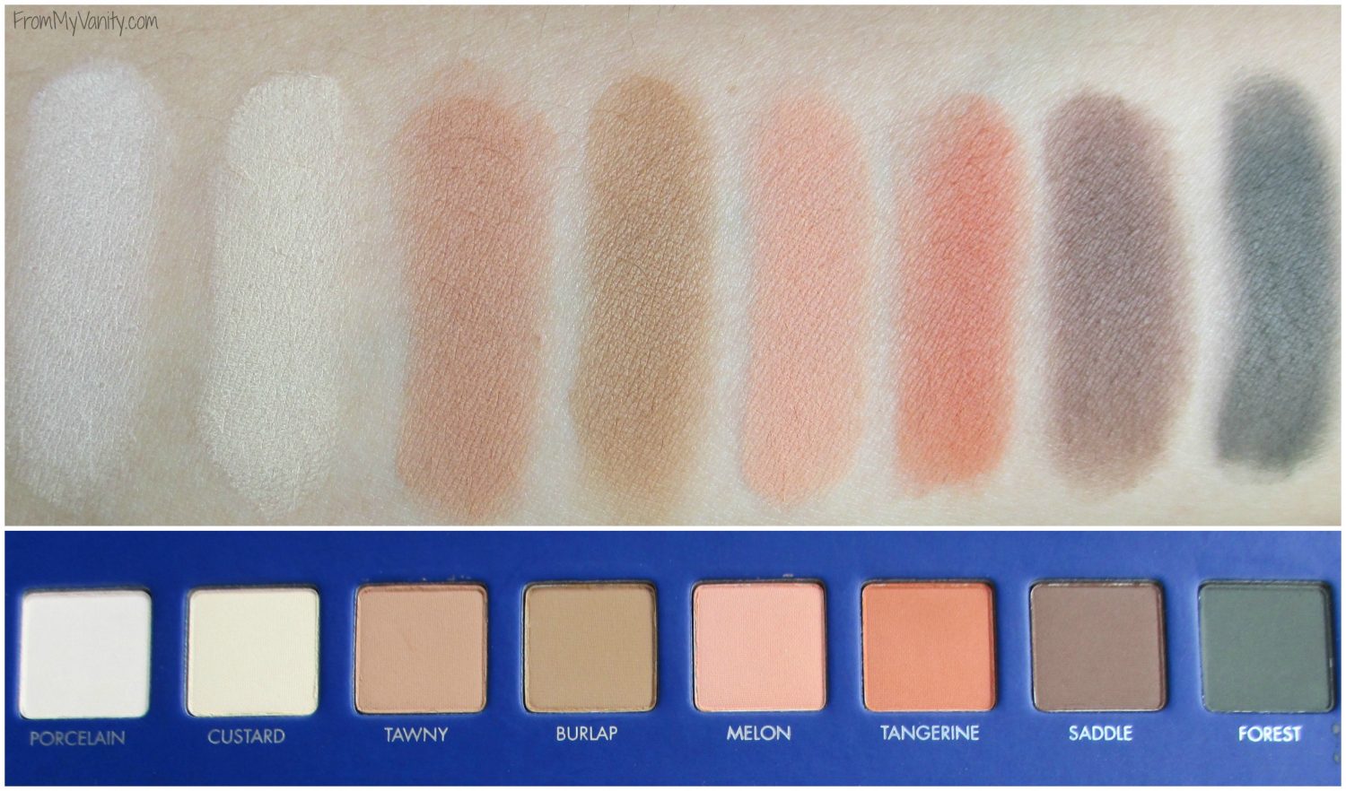 — Porcelain (matte): This color makes for a fantastic brow bone highlight. I’ve been loving this shade and use it in nearly every eye look I do. Because you always need a nice, matte highlight shade, right?
— Custard (matte): You could also use this as a brow bone highlight as well, and sometimes I do, but I actually find this shadow wonderful to use all over the lid after applying my primer. Very buttery soft!
— Tawny (matte): Makes for the perfect warm-toned transition shade. You’ll find you use this shade (or the next) in almost every color to start off in your crease.
— Burlap (matte): If you want a cooler-toned transition shade for your crease, this is the one you will use. I love going back and forth between these two shades to start off my eye looks with, depending on if I’m doing a warm or cool toned look.
— Melon (matte): This one is a beautiful peachy shade. I’ve played around with it, and have used it as a transition shade in a few looks. It’s also really pretty all over the lid, too!
— Tangerine (matte): Want to try an orange color this fall? This is the shade for you! I knew the moment I saw this color that I would have to give it a try, and I did (you will see it in one of my eye looks below). I love it and can’t wait to use it more!
— Saddle (matte): Even though brown and black shadows seem boring, I DO like to have these two colors in all my palettes. I like using just one palette for an eyeshadow look, so love that I don’t have to reach for any other palette to deepen up the outer V.
— Forest (matte): This color really excited me. I love playing with green shadows on my eyes, but actually only own shimmers or sparkles in this color. Never a matte. This color ends up being a deeper forest green than I had anticipated, but when I use it with a green or brown shimmer on my lid, you can tell it’s not a black. Nice touch!
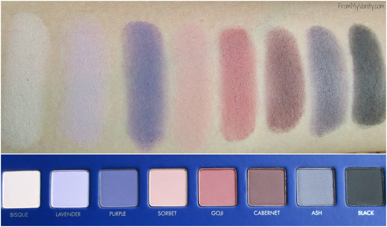 — Bisque (matte): This is the third brow bone highlight that this palette contains, and some people might think this is excessive and unnecessary. But I actually disagree — all three shades, while skine tone and matte — are very different! If you’re pale or tan, if you’re warm or cool tone….one of these three shadows will work for you. I love that LORAC thought of that, making this palette work for a wide variety of gals.
— Lavender (matte): I haven’t played with this color much, but it swatches very pigmented. If you’re a pale girl, I feel like this is a color you’d get a lot of use out of as a transition color for a purple look.
— Purple (matte): Someone want purple? While this isn’t a vibrant, bold purple, it’s a very soft, muted color. Again, this color would look really nice in the crease if you were creating a purple eye look.
— Sorbet (matte): This color is so pretty! I’ve used it both all over the lid and as a transition color. It’s got the perfect amount of pink to warm up the look, but still enough peachy-skintone color to make it look natural (and not like you’ve been crying or something, lol).
— Goji (matte): I was really scared of this color. Pinks tend to make me look like I’ve been crying. But, once again, LORAC has put a lot of thought into this shade and gave it just the right amount of peachness so it works perfectly for me.
— Cabernet (matte): Yes please! A beautiful blend of red and brown, this color is perfect to deepen up the crease on those warm campaign or pink eye looks. I’ve gotten a lot of use from this shade!
— Ash (matte): This is another shade I haven’t experimented with too much. I have tried using it in the crease a few times and it works. It’s just an interesting color, in my opinion. It isn’t black, but it isn’t really gray either. It’s very ashy, just like the name implies!
— Black (matte): As I already mentioned, I think it’s important to have a dark color in every palette so you can have something to smoke out the outer corner with, and LORAC is well known for giving their gals a black in their PRO palettes. 🙂
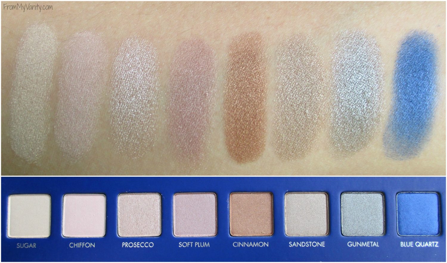 — Sugar (shimmer): This shadow doesn’t have a lot of color to it, but lots of shimmer! (It’s so hard to get shimmer to show up in pictures!) I’ve found this works really well as a ‘shimmer topcoat’ to any look.
— Chiffon (shimmer): And enter our first dud of the palette! 🙂 Okay, so maybe I’m just not using it right, but this color has very little color to it and even less shimmer, in my opinion. Especially compared to it’s next door neighbor…
— Prosecco (shimmer): This color is gorgeous! It’s a beautiful shimmery color that has just a touch of pink in it. I’ve used it several times and like it — both with and without a base color underneath.
— Soft Plum (shimmer): This works best, in my opinion, with a white or nude base color underneath it. It will still show up if you don’t use one, but it takes a bit more work to build up the color.
— Cinnamon (shimmer): This shadow is heart-stopping! I love these types of colors, so of course this speaks to me. The shimmer in this color is beautiful and catches the light beautifully!
— Sandstone (shimmer): Okay, this shadow I’m a little torn on. It’s a pretty color, has a decent amount of shimmer, looks pretty on the lids…but when compared to the next color in the palette, it just looses some of it’s intrigue. If you like very muted, toned-down colors, I think you’ll love this color, but I like a bit more ‘pow’ to my shimmer shades. 🙂
— Gunmetal (shimmer): This color just totally overshadows Sandstone — it’s so shimmery, pigmented, and beautiful! It’s more gray than Sandstone (which is more taupe). When applied on the lids…it’s just beautiful!
— Blue Quartz (shimmer): This color is BLUE! I think it has more of a sheen to it, than a true shimmer, but it’s still gorgeous. When I saw this palette, this was one of the colors I knew I’d have to create an eye look with for this review. 😉
 — Moonlight (shimmer): I feel like this shadow is the same as Sugar…except the better formula. It definitely has the shimmery aspect of it and just a touch of yellow to give it some color. It would also work as a shimmery shadow topper or on it’s own with, say, a white base underneath.
— Seashell (shimmer): This one is sort of a dud in my opinion. It’s very, very powdery and you have to really pack it on in order to see any shimmer. And even then I feel like it’s just the faintest sheen. I haven’t found much use for this shade yet. At least with my yellow skintone.
— Peony (shimmer): I love pink-champaigne shimmer shades to put on my eyelid, and this color is that perfect shade! Though once again, if I want more of shimmer over a sheen, I find that I have to apply a white or skin-tone base underneath to really make it pop.
— Dark Sienna (shimmer): This was another color I knew I was going to love before I even swatched it…and I was right! The color is so unique — depending on how I look at it, or what shades I’ve paired it with, I feel like it can look more brown, more burgundy, or even purplish! It’s not really a duo chrome, I don’t think…it’s just that type of color that will kind of clone with the colors it’s paired with. If that makes sense. It’s definitely a shade that is underestimated just looking at it in the pan!
— Penny (shimmer): This color is a beautiful bronzed brown color that has my name written all over it! As you can see from the swatch, it’s very pigmented! While some shimmers are hard to build up to full color potential when applying it to the lid, this color is the exception!
— Olivine (shimmer): Once again, this shadow reminds me a lot of Sandstone, except with a better formula. It’s shimmery, bordering on sparkly and has a beautiful silver-olive color. It’s gorgeous!
— Gold Leaf (shimmer): This one is another dud in the palette. Looking at it in the palette I expected a beautiful, true gold sparkly shadow that I was itching to put all over my lids. But once applied it was just a really powdery, pale gold color that had very little shimmer. Maybe with a white base this color could pop enough to get use out of, but I was just really disappointed with it. Maybe because I had such high expectations?
— Black Ivy (shimmer): I haven’t had too much opportunity to play with this color, mostly because it’s such an intense shade! I can totally see me creating a fun New Years Eve look with this shadow, though! It’s just like their typical Black eyeshadow, except with a beautiful amount of shimmer. Not too chunky (like sparkle) so it gives the perfect, subtle shine to your eyes.
 Whew! That was a lot of shadows! But I thought it was the best way to give a concise, detailed review of the eyeshadows without rambling on and on. 🙂 As you can see, there are a lot of great colors in this palette along with a few duds. I think there were 3 duds, in my eyes, and that’s pretty good for a palette filled with 32 eyeshadows! And you can create a lot of different looks with just this palette. Did you notice that? From orange, to blue, to burgundy, to silver…the LORAC Mega PRO 2 palette has a lot of variety and pops of colors mixed in with your must-have , neutral transitional colors.
Ready to see some looks I created just using this palette? Here are four of them — from super simple to full-on glam!
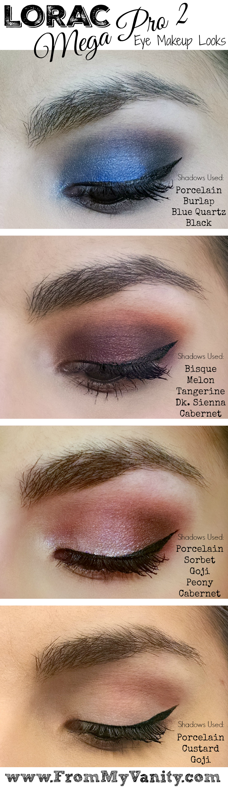 Isn’t Blue Quartz just stunning?! And do you see what I mean about Dk. Sienna pulling a different color than you would expect, just looking at it in the palette. It’s beautiful and I know I’ll be using it a lot this fall! I will say, as a word of warning for those who’ve never tried the LORAC PRO eyeshadows before, that they’re very buttery soft. If you’re really rough dipping into these shades, you will kick up a lot of shadow. And it’s important to tap off your brush before going at your eye with any of the colors, or fall out is eminent. If this is something that bothers you, you’ve been forwarned! I wanted to make sure I also addressed this palette in comparison to last years original Mega Pro palette. Let’s take a look at them, side by side.
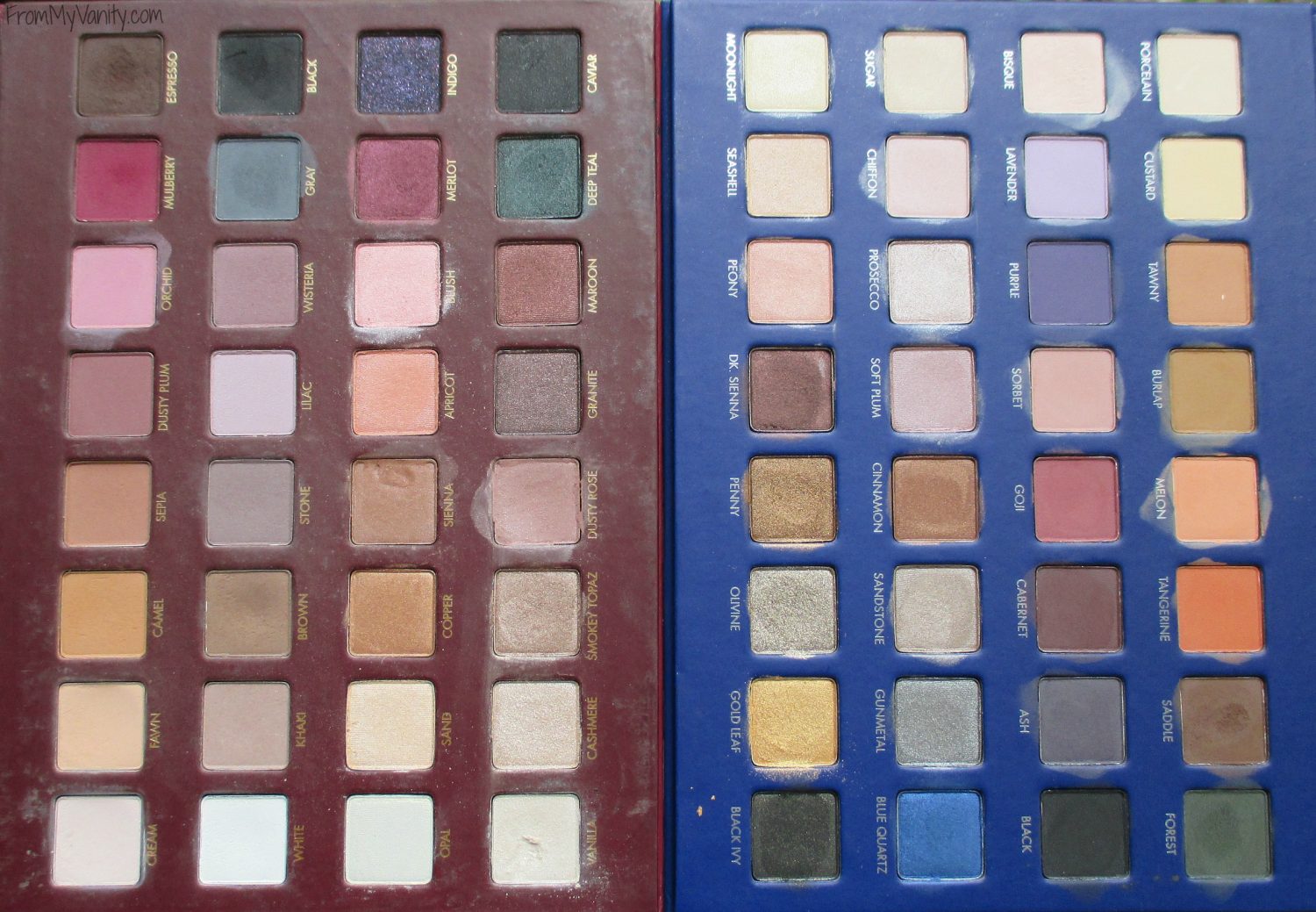 As you can see, last years palette had a lot of similar shades and colors — even moreso than this years, in my opinion. The Mega PRO had lots of transition colors and browbone highlights, and even the other ‘fun’ colors tended to stay in the same color family, if you know what I mean. Lots of browns and mauves — which isn’t a bad thing. Goodness knows I love those colors! But besides the Deep Teal, Indigo, Mulberry, and Merlot, there weren’t any fun pops of colors in this palette. Now take a look at the Mega PRO 2 palette…this palette has tangerine, Purple, Goji, Dk. Sienna, Penny, Blue Quartz, Olivine, and Gold Leaf, to name the most obvious. So if you weren’t interested in the Mega PRO 2 palette because it looked boring, but you have the Mega PRO and love it…you might be missing a real gem!
 But, down to the nitty-gritty — do I recommend the LORAC Mega PRO 2 palette. If you’re a fan of the LORAC PRO eyeshadow formula, than I totally think this palette is a must to snatch up. It has a lot of fun colors and it’s so blendable and easy to use — LORAC’s eyeshadows are my most used and most loved palettes (and that is saying a lot coming from this eyeshadow palette obsessed makeup junkie!) If you are a beginner or just starting out with makeup, I think this is also a great investment. It gives you a variety of shadows at an affordable price — it comes out to around $1.85 per shadow! Come on — that’s amazing for a high-end brand!
I think I’ve said enough — y’all know I love and highly recommend this palette. 🙂 Now I’d love to hear your thoughts. Did you buy this palette? Do we have similar feelings about this palette, or not? Share with me in the comments below!
PIN IT! SAVE IT!
The products mentioned above were purchased with my own funds. I was not compensated in any way for writing this post. Affiliate links are used. All thoughts are 100% my own. 🙂
